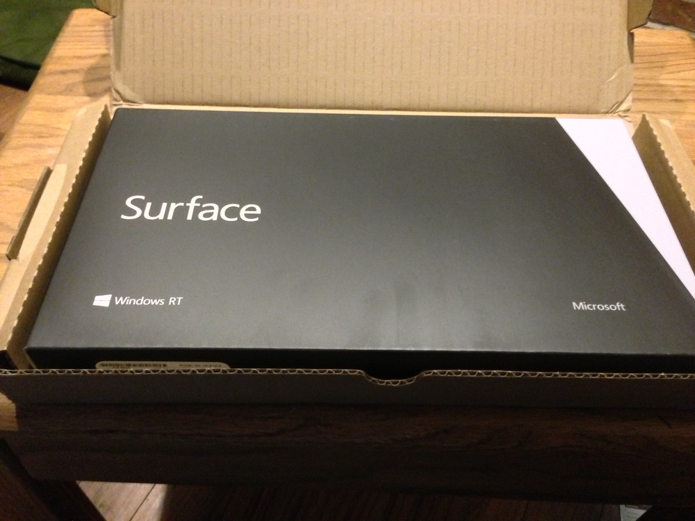
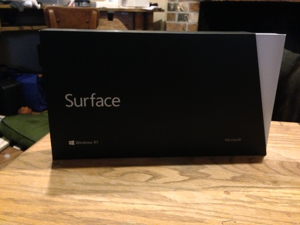
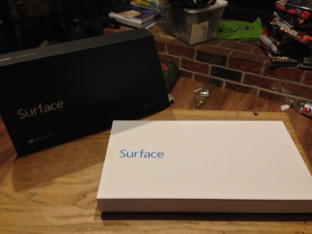
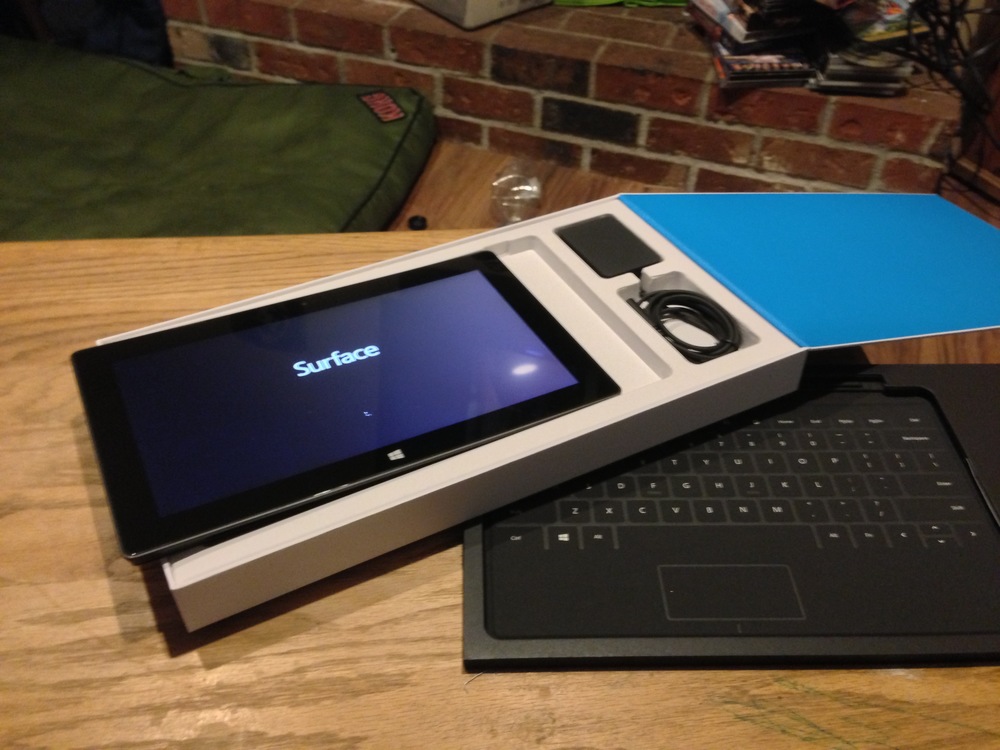
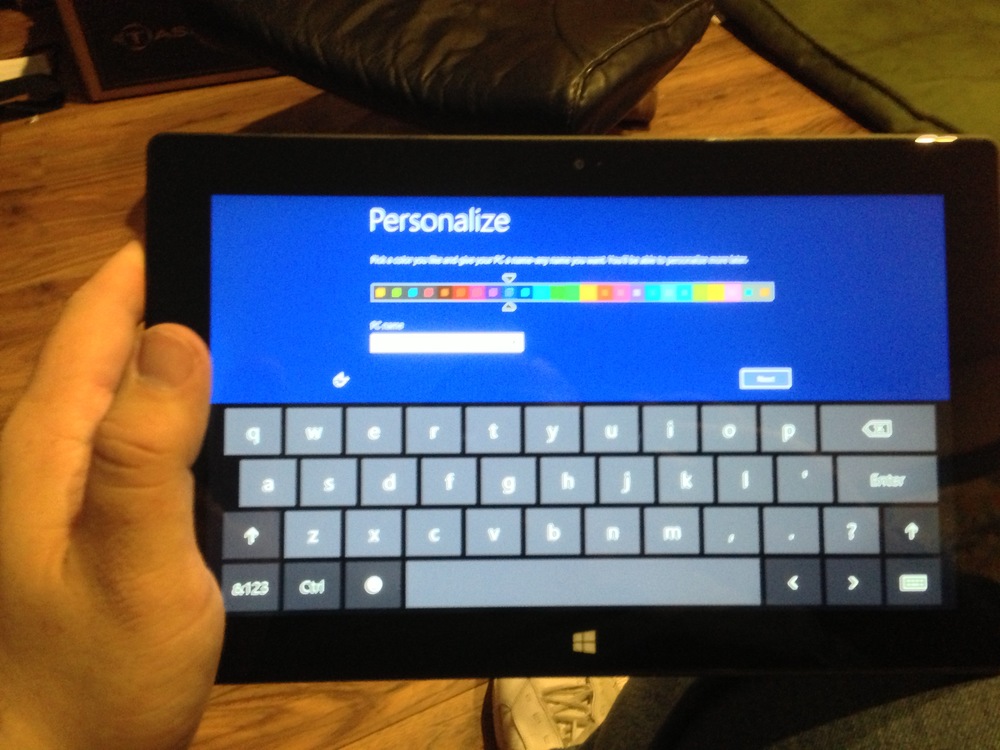
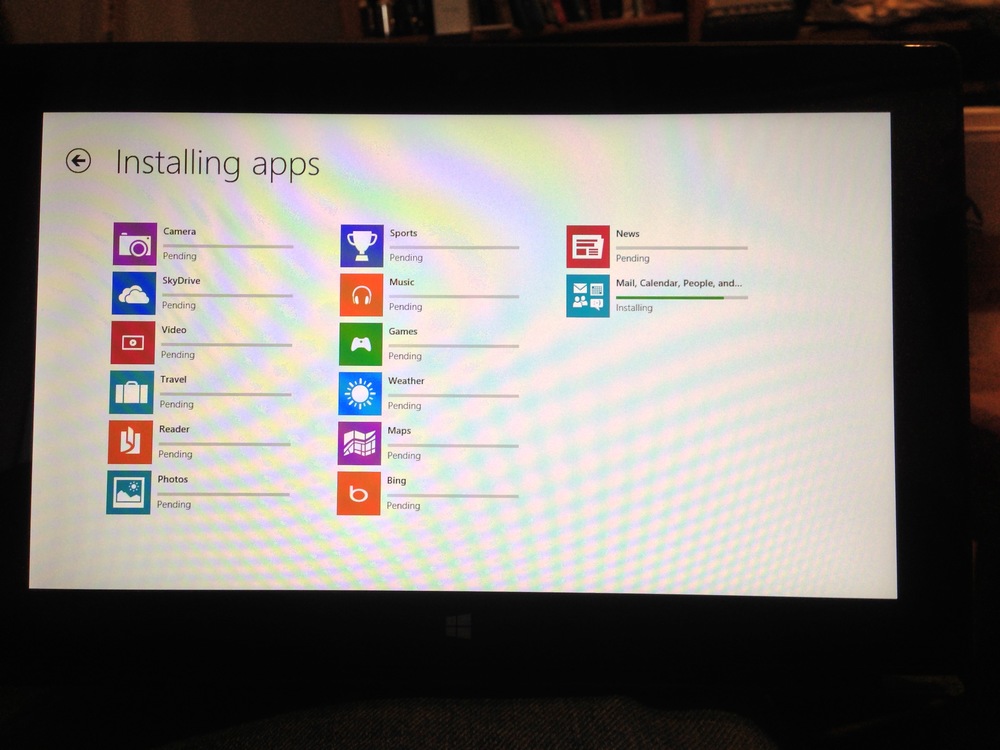
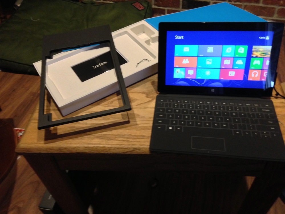
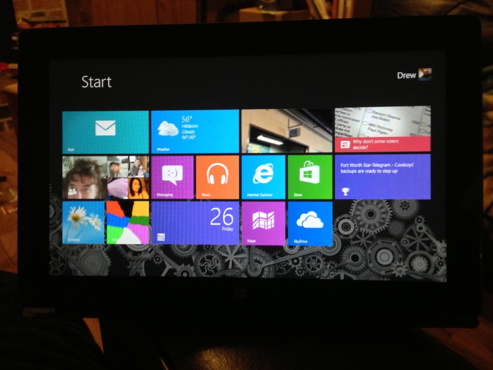
 The home screen of Windows RT on the new Surface from MicrosoftMicrosoft for the first time has released their own computer, and it could be a game changer. Fed up with hardware partners failing to capture their vision of tablet computing they have this week released Surface, a bold new take on the world of mobile computing. Featuring a power efficient Tegra 3 processor from NVIDIA and finally removing backward compatibility from windows they have been able to strip their vaunted operating system down to its bare essentials. A complete re-imagining of Windows has been needed for a long time, and I think Microsoft has hit on a winning formula here. What remains to be seen is how quickly software developers start writing programs that will run natively in Microsoft’s new “MODERN UI”. Without developer support this grand experiment is destined to fail.
Hardware
With a new hardware and software platform, it is impossible to really compare specs for hardware. The surface has some interesting design cues, and Microsoft’s design team has made some risky design choices that I think they have really pulled off here.
The touch keyboard doesn’t seem like it would work. 3MM thick, no moving parts…it would seem to most to be a token gesture towards a physical keyboard. However, after a few days using it I am writing this review using it and am more than happy with its responsiveness. Unlike many of the netbook keyboards we have seen over the last few years, the touch keyboard cover that is available with Surface has a surprisingly roomy keyboard, with nice separation between keys and a decent feel. It takes some getting used to, but once you do it is like a whole new world.
One thing that became clear when watching the official release keynote for Surface was how much thought went into the smallest features of this hardware. From the sound made when the kickstand is deployed or stowed to the angle of the cameras being set to account for the slope of the Surface when using the kickstand, no aspect of this hardware design was not thought of and planned for a specific reason.
Surface with Windows RT features 2GB of RAM, a 1.5GHz Tegra 3 processor, and either 32GB or 64GBs of flash storage. There is no benchmark software available in the Windows Store yet, and no other devices to compare it to anyway, so in depth numbers cannot be a part of this review. What I can say is that while some software takes a bit to respond, it does not seem to be a resource issue. With more than ten applications running programs had the same response issues as they did when running alone. Surface is a very responsive system, and on I could see replacing an Ultra Book or Net Book in just about anyone’s workflow.
Software
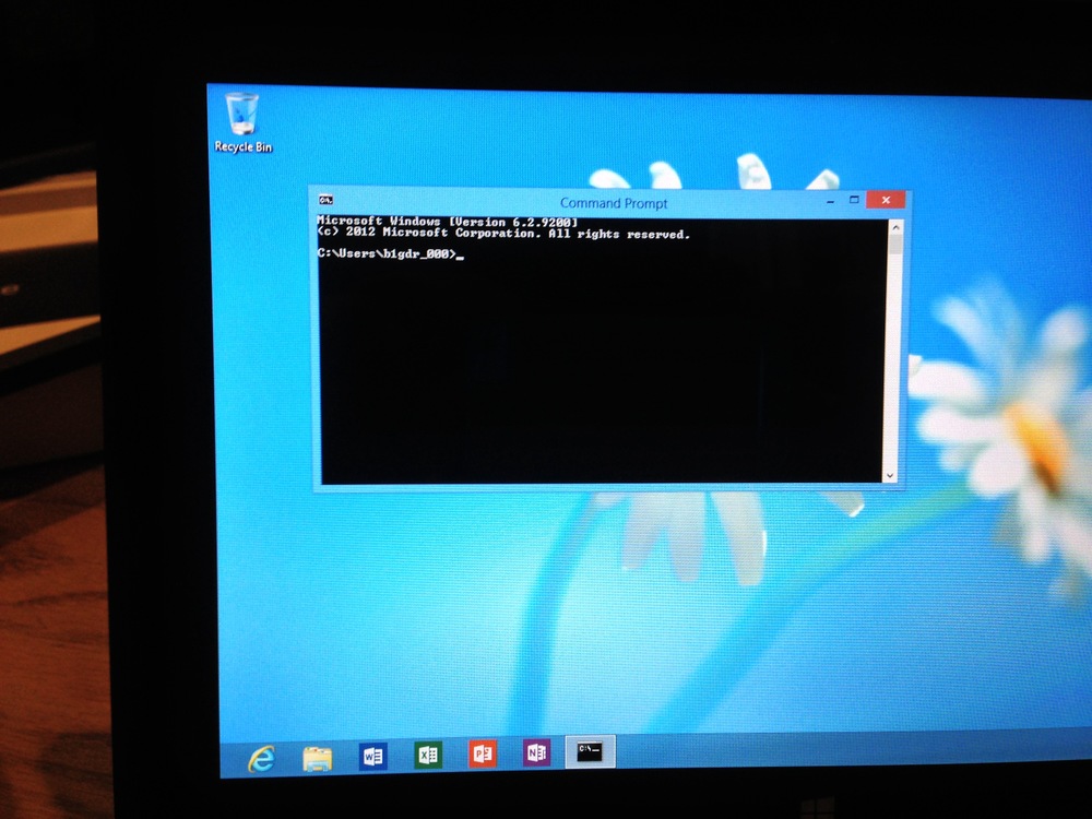
Windows RT is a new and vastly different operating system than Windows 7, and that is easy to see when the Surface first comes on. The live tiles are not just the first thing you see, they replace the start menu so crucial to previous versions of Windows. Make no mistake though, this is Windows, right down to the command prompt. The biggest difference is “legacy” software. It can run under Windows 8 Pro, but not on Windows RT. This makes getting software written for and offered through the newly minted Windows Store critical in the short term. Without software, this platform is doomed to falter.
