Review: Kindle Fire HD 7"

It was about a year ago that I started this website with a review of the Kindle Fire.  A lot has changed since then.  Tablets have grown to a point where the iPad sold more than any BRAND of PC last year.  Expectations have been increased to monumental proprtions that few devices have a chance of living up to.  Google worked with ASUS to release the Nexus 7, and still didn't capture 10% of the global tablet market.  With all of these facts, Amazon announced their new Kindle Fire HD line.  The first device to arrive in consumer hands is the 7" version.  

The Fire HD improves on every aspect of the original, without increasing the price. The Kindle Fire HD 7" is $199 for the 16GB version, $249 for the 32GB variety.  The new Fire HD is much faster, resolving all of the actions attempted more than twice as fast as the original.  All of the problems I had with the original have been resolved, much to my enjoyment.  The Book app now allows for changing the background color, font size, and font quickly and effectively.  The addition of hardware buttons corrects the most glaring flaw of the original.  Most importantly, Amazon's app store offerings are now much more robust, with many applications already updated to take advantage of the improved resolution of the HD.

Starting at $299, the new Kindle Fire HD 8.9" is likely to cause the biggest stir when it arrives in November.  At the price points Amazon is able to deliver, the competition is not easily going to be able to compete.

Look below for pictures of the unboxing and getting started guidance.


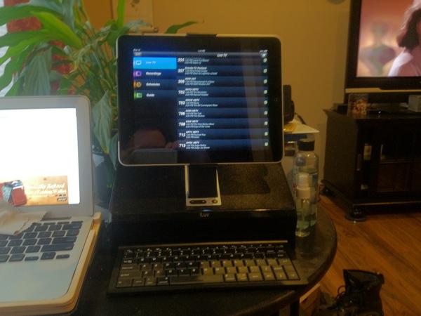
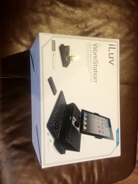
Review: iLuv iPad workstation

I got this in a few weeks ago, and have been using it to see how it works. I love the form factor. It reminds me of an old PC, Jr. - desktop form factors amazingly have a retro feel even though they are really not old enough for that label.
First, the sound quality is great, and volume is easily loud enough for any office or family room. The remote control gives great flexibility, and the keyboard locks into the base to save space when not needed. Since the iPad (it's compatible with all 3 models) docks with the workstation, no pairing is needed and interference is not a concern.
I have been using it with my original iPad as a home entertainment control for about a week, and am very happy with it in that roll. I can send video via AirPlay to my apple tv to share sound and video with the whole family, and it serves well as a tuner for my eyeTV that is served by a Mac mini.
While I had concerns over its ability to hold a place in my life, don't see myself giving it up soon.

iPad (3rd Generation) - First impressions

WOW.  I was prepared based on what I had heard from others that the screen would be amazing, but it didn't prepare me for how good this thing is.  Better color, better brightness, and amazingly clear graphics.  The only bad thing I can say about this screen is that web photos really need to improve, because they look like crap a lot of the time on this screen.

The speed is the other thing that suprised me.  Having been in the tech business for a lot of years, I know that increased video processing can make a huge difference in games, but I wasn't prepared for how much it would improve every part of the experience.  Even opening and playing video from the web was amazingly improved.  Whether this is all due to the improved processor, or is also impacted by the increased RAM, it is really a sight to behold.

I haven't tried any really intense games yet, because most of the last two days has been using the things I always use everyday to see how they are improved.  I also have been repourposing my iPad 2 64GB 3G for the wife to replace her iPad 1.  Since she uses her iPad for work, getting it dialed in and making sure everything is working the way she wants it to in preperation for work on Monday has been a priority.

I will spend time this week really putting the NEW iPad through it's paces and reporting back here.

iPad release week - Must have accessories

OK, I know some of you have pre-ordered the NEW iPad.  Since I'm as anxious as everyone else, I thought I'd do some posts this week on things you can buy to get ready for it's arrival.  Most accessories for the iPad 2 will work fine for the NEW iPad, so most of my reviews will still be helpful to you all.  I won't know until it comes on Friday whether the extra .03 inches thickness will affect case fit, but I think my favorite cases should work fine (at least I hope I don't need to add even more to my collection!).  Even if the ones I have don't fit, all of the companies below either have announced or are already shipping cases that WILL.

First, let's talk about cases and covers.  There have been thousands of cases released since the original iPad was announced, and with all things some are definitely better than others.  The biggest thing to decide on is what TYPE of case or cover you are looking for.  If you want an integrated keyboard to turn your new tablet into a net book, ClamCase makes the the best on the market.  It will double the weight and more than double the thickness, but when you have a lot of text to enter (like writing a post for your blog or a long email), you'll appreciate having it along. I have the Storm Trooper limited edition, and it is the only keyboard case I use regularly.

If you prefer a case that looks like a book, DODOcase is my favorite. The folks at DODOcase have taken the best of traditional book making and brought it to the iPad in dramatic fashion.  I really am hoping that my DODO works for the new iPad, because I would hate to have to get another one (I have three already, and I don't know that the wife would understand the need for another).  They have several special editions, and just started offering several foil-stamping options to personalize them to your needs.

For those of you looking for something that looks great on your desk or the coffee table, but adds even less size and weight, a local Portland company makes my favorite case. Grove makes a beautiful bamboo case with your choice of felt or leather cover.  The Grove cases are not made to be ultra-durable, and I wouldn't throw one into a bag full of other loose gear, but they are awesome for what they are.  They can burn any design you want (including family crests, company logos etc.) into the leather, have several designs from local artists, and the build quality is top notch.  You need to check these things out.  They are handmade, so delivery times can take a while.  Get in line now if you want one.

For full coverage protection without adding much for size, my choice is the Marware MicroShell Folio.  Nice and slim case, stays on well and uses the SmartCover feature to wake your iPad like all good cases.  It is well made, and Marware has been in the accessory business long enough to have quality in every item they make every time.

It's going to be a great week for Apple fans. 

Review: iPhoto for iPad

At today's Apple Event, iPhoto was announced for iOS.  Not only is it well done, but it really changes the face of photo editing.

When you launch the application, you are greeted by the program indexing your photos, including your photo stream.

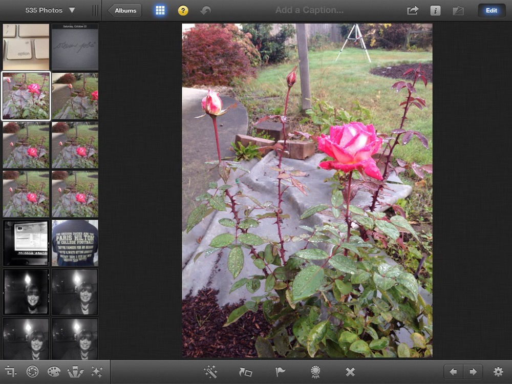
Once you select a photo, you can select edit, which brings up your tools, just like it does on the Mac

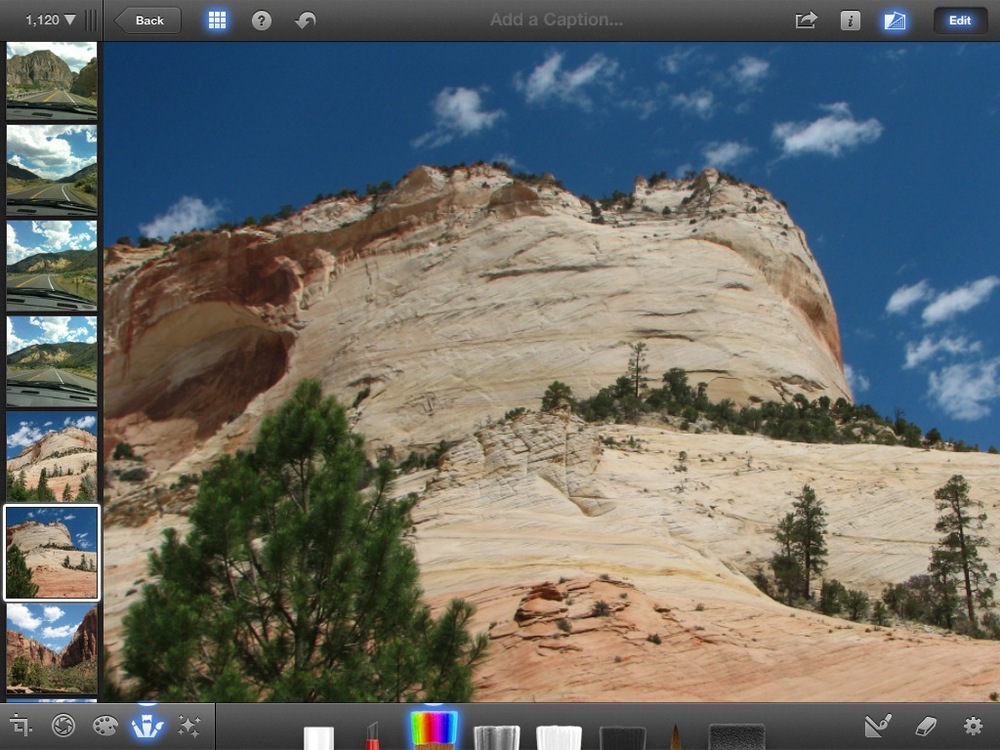
Your options are on the tool bar along the bottom.  From left to right they are: Crop, Exposure, Color, Brushes, and Effects.

While many of these don't seem too game changing, the biggest place the iPad version shines is the brushes.

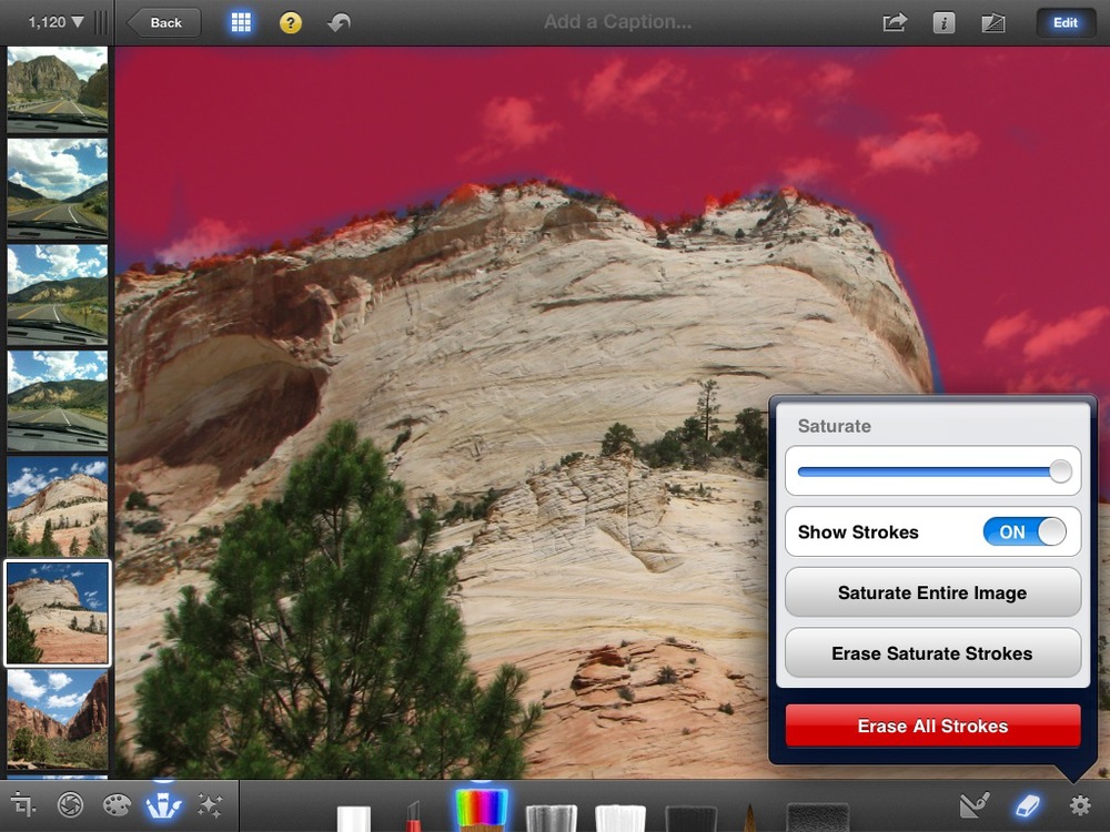
Here is the picture I started with.  The sky was pretty washed out, but I like the way the trees and rocks look, so I just want to brighten the sky by over saturating the color.  I select the saturation brush, and pull up options.  I can turn the brush strokes on, showing me the areas I am adjusting:


As you can see, I used my stylus to paint the sky and clouds with the saturation brush, avoiding the rest of the picture.

Here is the before:


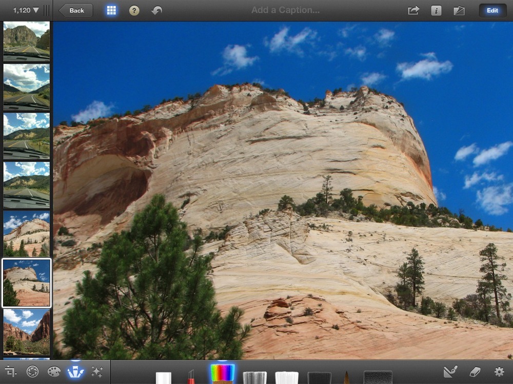
and the after:

If you have ever tried to do this kind of masking and color correction, you know how huge this is.  Imagine a real estate agent not needing to wait for a sunny day to take a picture of your house.  Just dial up the blue, and make any other corrections needed so that the picture looks just like the house (we all have seen pictures where colors are off just enough to make a difference in your impressions of the subject matter).

And everything, from taking the picture to the editing and uploading to the web, or emailing the photo can be done with one device.

The best part though, is all of these things are possible in your iPhone now too.  This really is the post-pc era, and Apple is leading the revolution!

Old-school fun for the family!

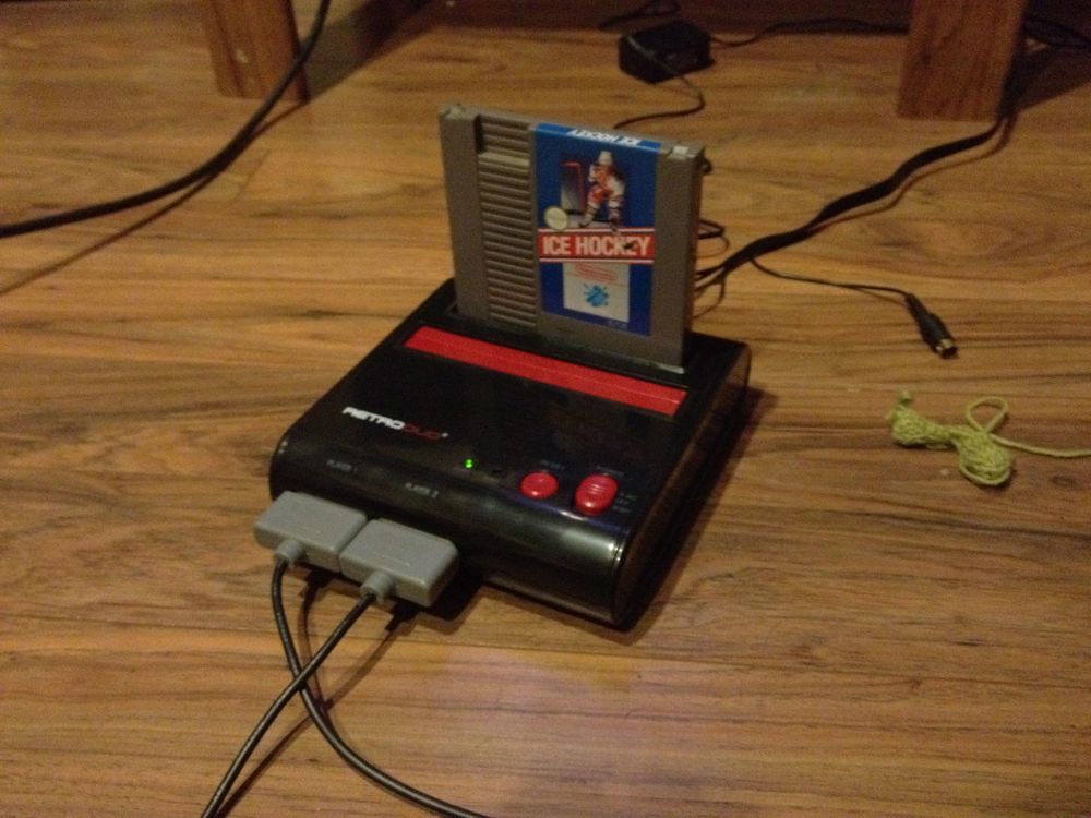
The guys and gals at ThinkGeek just sent me one of the coolest toys I've gotten so far this year.  The Retro-Duo takes the internals from both Nintendo's original NES, and those of a Super NES to allow you to pull out your old carts and give them new life.

Since most modern TV's have made the old 75ohm connectors we used to attach cable boxes to disapear, the output boards allow for composite (Yellow video, Red and White audio) or S-Video output.  I had to hunt through bins at 3 different Goodwill stores to find games (my NES stuff went bye-bye a LONG time ago), but was able to turn up Ice Hockey and Golf to give it a spin last night.  When you can find them, carts are a lot cheaper now than they used to be.  I got both games for $6.00.

10% off orders $55 or more! Enter code: cmsave10

My son and I had a blast (after I was forced to explain that these were actually good graphics when I was 10 years old).  It took him a while to get used to the strange controls, but we had a couple of good games.  I beat him, of course, but it was still some nice father-son time.

Sphero has arrived!

When Sphero was first announced I thought it was an interesting idea, but didn't know if it was something I could really love. Now that it has arrived, I can't stop wondering what these guys will come up with next. I'll be playing around with them more tonight when the kids get home, but here is a quick rundown.
Sphero is a remote-controlled ball. I know, not very exciting at face value.

The thing that makes Sphero great are the applications. Golf, where you use the iPhone or iPod Touch as a virtual club. Sphero, which is just a simple remote control to play around with it. SpheroCam, which lets you shoot video and pictures of your Sphero in action. Draw&Drive let's you draw a path on the screen of your iDevice and watch the Sphero follow the path.

The exciting thing is what could come next. I can think of tons of applications. I would detail them here, but then I wouldn't be able to sell the apps.

Stay tuned for video and fun with the kids tomorrow.

LunaTik LYNK - Turn your iPod into a great watch


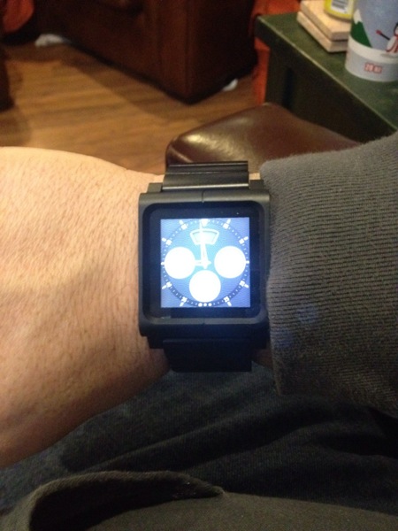
LunaTik is a crazy little company. They started as a KickStarter project just after Apple announced the touch-screen Nano. They started out trying to raise $15k for this idea, and ended up raising over $1M. Now they have been able to bring several products to market, and even have been featured in an Apple keynote.
Which brings us to their newest product, the LYNK. $139.95 turns your iPod Nano into perhaps the best watch you've ever owned. Easily adjustable, with features no one else could dream of having in a watch. 16 watch faces. A design that bolts on to your iPod so you don't need to worry about it popping off, regardless of the activity. Built-in Nike+ training features. Carry music, audiobooks, podcasts, pictures......it is truly a great watch. Check one out, you won't be disappointed.

Hiding in plain sight - The best in bookbinding meets technology

There are two companies that have set a new standard in merging ancient techniques with modern technology.  Pad & Quill and DODOcase.  They first came to my attention with the iPad, but have since expanded their lines to include the Kindle Fire, and now even the MacBook Air.

I have always loved my DODOcase for my iPad, but have also been impressed with the quility of Pad & Quill's iPad and iPhone 4 cases.  So when I had the opportunity to put multiple products from each company head to head, I couldn't pass it up.

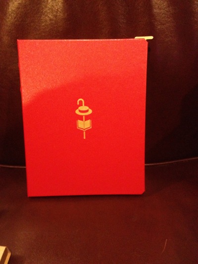
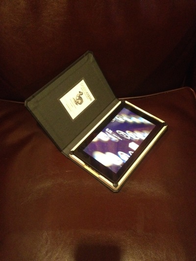
DODOcase sent me their "Morris Lessmore DODOcase", and the "DODOcase for Kindle Fire".  Both have amazing quality, and perfect attention to detail.  From the well chosen colors to the detailed embossing and foil stamping on the Morris Lessmore, to the well done wood burning of a campfire inside the Kindle Fire case, DODOcase has brought the craft of book binding to a new audience that is quickly replacing well-crafted first edition books with eBooks.

DODOcase's Morris Lessmore cover for iPad2DODOcase's Kindle Fire offering

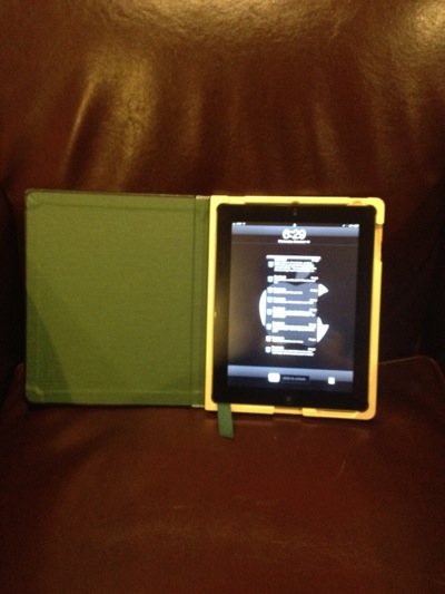
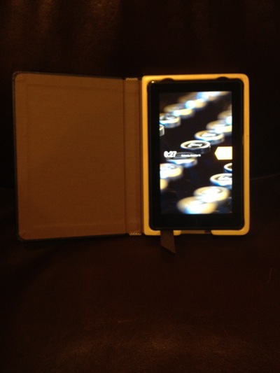
Pad & Quill sent me the "Octavo Case For iPad2®", "The Cartella Case For Macbook Air 11 inch", and the "Fire Keeper".  Pad & Quill allow for more color choices for end papers, and also allow for an optional inside pocket (options not as cusotmizable from DODOcase).  Like DODOcase they have great crafters making the binding shine, and their attention to detail is amazing.

The Octavo cover for iPad2 from Pad & QuillPad & Quill's "Fire Keeper"

I really have a hard time calling one better than the other, as they both are making some amazing products.  DODOcase has done some very nice things with special editions, incorporating some beautiful artwork from local artists, and using classic embossing and foil stamping techniques sets them a little bit above Pad & Quill from a looks standpoint.  On the other end, Pad & Quill have a solidly built product that offers a bit more protection.  The wood tray that holds the device (regardless of model) from Pad & Quill is more solidly built, and shows more polish than DODOcase's offerings.  

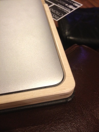
Over the last two weeks I have switched back and forth on my iPad 2 and still cannot decide which I like more. Our house is divided when it comes to the Kindle Fire products.  I love the DODOcase, my teen daughter prefers the offering from Pad & Quill.  Both are well built, and I think for her it came down to the cute little ribbon bookmark that comes out at the bottom and functions as a nice way to remove the device from the case when wanted. Since DODOcase hasn't made a product for the MacBook Air yet, my Air hasn't left the Pad & Quill case since it arrived. I haven't had any heat issues, the cutouts allow for use of all ports quite nicely, and the polish makes it comfortable even with my hands resting on the wood while I type.

Corner detail on Pad & Quill's The Cartella Case For Macbook Air 11 inch

No matter which company you go with, you are sure to be pleased.  Both companies are bringing old fashioned technology to a new audience, and doing it with amazing levels of style.

Last iPad case reviews of the year - I think


OK, it's time for my final case reviews of 2011.  I have had the luxury of using about 25 iPad 2 cases this year, and they have run the table.  From overpriced and truly un-functional, to great values that my friends have willingly taken off my hands over the high-priced name brands.

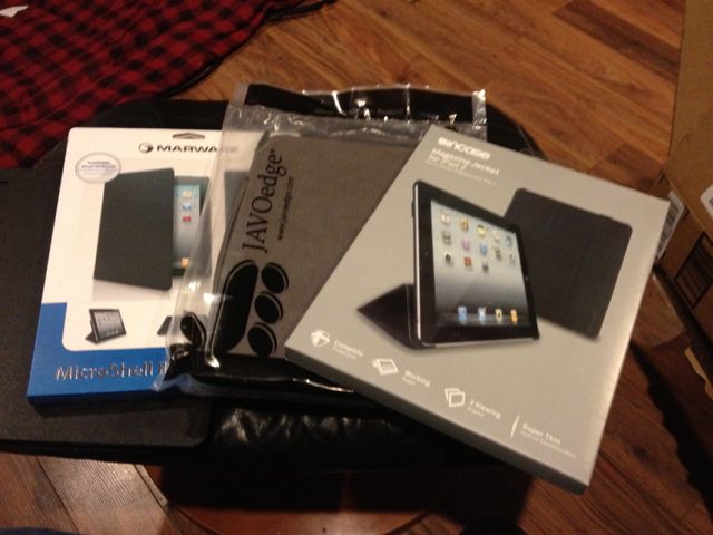
Here are the last 3.  I like them overall, but one has become my day-to-day case.

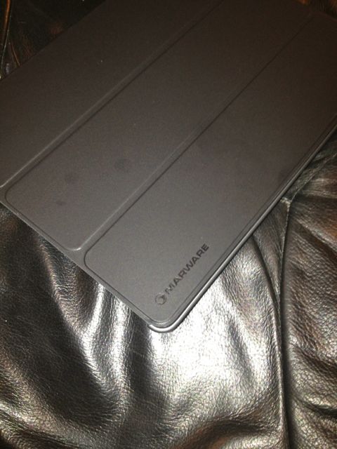
Marware MicroShell Folio for iPad 2 Black

This case really suprised me.  A solid ABS plastic back with a smart cover attached.  Nice detail, magnets on the cover are strong enough to prevent the case from opening in my bag on the way to work.  Adds a solid comforting feel to the iPad without being obtrusive.  I have started using this every day when I want to be able to just throw my iPad into my bag to head out the door.  Marware has been making cases and accessories for a long time, and they got this one right.  There are very few cases or sleeves that have come alng that I decide to hold onto.  This will be one of them.


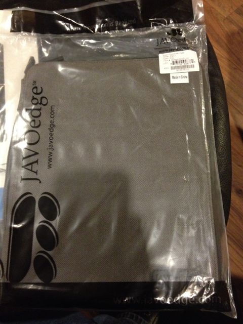
JAVOedge Austin Commuter Case for the Apple iPad 2 (Gray) - Latest Generation

I had never heard of JAVOedge before receiving this case, but I can tell you I will be on the lookout for other products if this is an indication of what they produce.  This is a great case to take along if you don't have a bag full of gear going with you.  It is a little bulky to throw into my gear bag, but on those occasions when I just want to take my iPad without taking the kitchen sink, this performed well.  It is well padded and has a secure hold on the iPad when opened.  When zipped shut, I had no fear of impact damage at all.  Stiching was well done, and quality control seems to be excellent.  If this is the type of case you are looking for, you can't go wrong giving this a try.

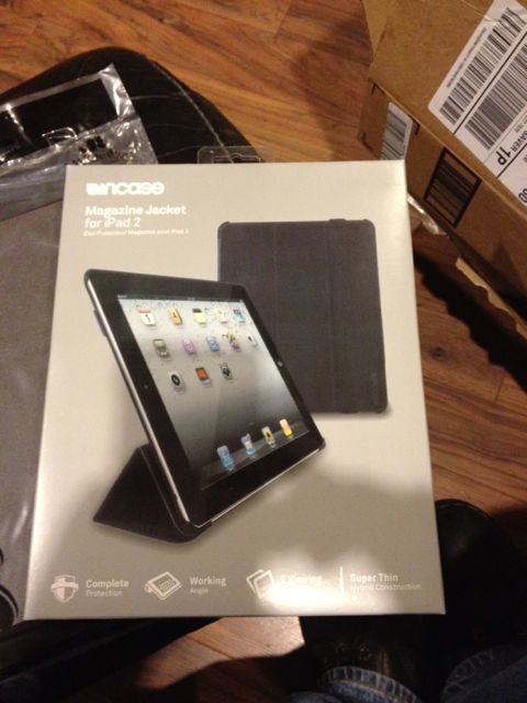
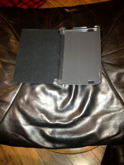
Incase Magazine Jacket for iPad 2


Incase has been in the accessory business for a long time, and the construction on this case shows off all that they have learned.  It is sturdy, has a secure elastic strap to hold it closed.  Solid ABS plastic provides a good feel of protection and firmly grips the iPad when it's open.  The reason it won't see regular use in my day is a curious choice.  They elected not to make the cover a 'Smart Cover', which is to say that it doesn't turn the iPad on when it gets opened.  For the price and with the other cases on the market, what could have been a home run has become a nice also ran in the case game.

Case Roundup - Kindle Fire

Ok, so I've had the fire for a couple of weeks, and have enjoyed using it.  I also have had the opportunity to review a few cases, and figured I would share my thoughts.

As with any tablet, protection is important.  I wouldn't think of carrying my Fire without a case any more than I would my iPad or iPhone.


Marware - Microshell

The Microshell from Marware comes first.  I really like the way it fully surronds the tablet, providing a non-slip surface on the out side, and combines a great east to fold back cover.  This makes reading it like a book quite easy, and provides decent scratch protection for the entire unit quite nicely.  I have my doubts that it would provide much as far as impact protection, but I don't really plan on treating it too rough any way.

Marware - C.E.O. Hybrid

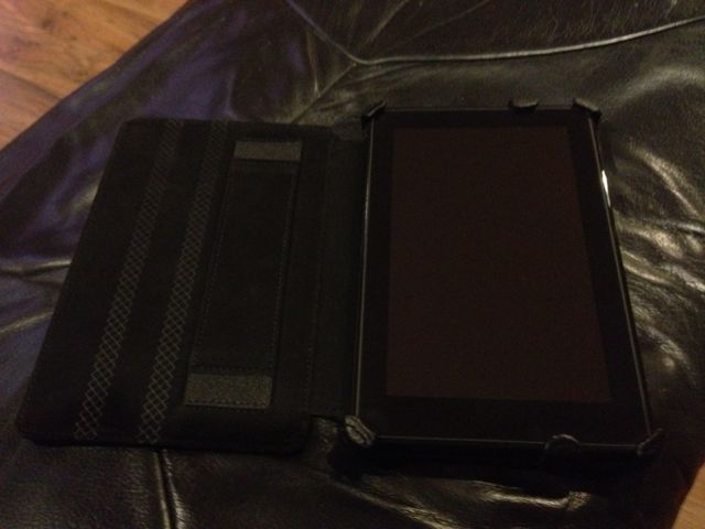
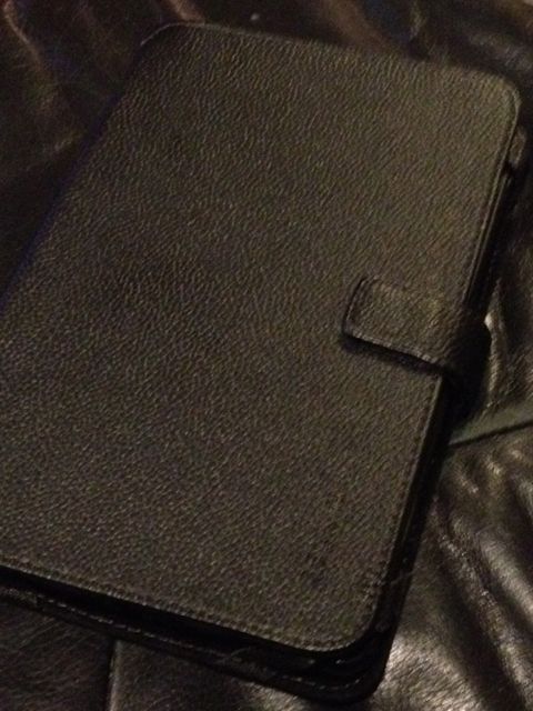
Marware's C.E.O. Hybrid is a beautiful case.  Nice leather grain, with just a touch of padding makes it feel much more likely to provide impact resitance should I lose my grip on the Fire.  It has a nice hand strap for easy one-handed holding of the Kindle Fire, and a strap that holds the cover tight to the screen when closed.  It provides coverage to the corners, but very little to the edges, making it much more of an executive and responsible adults type of case.

Belkin - Verve Tab Folio for Kindle Fire

Belkin's case is pure simple utility.  Not a lot of bells or whistles, not much to protect your investment.  The magnetic closure on the strap is a nice touch, but there are far better cases (like those above) available at the same price point.

Amazon Kindle Fire Review (round 2) - The Boy takes another swing at it

After more usage of the Kindle Fire, I seem to understand it more.  It's heavier than the iPhone, lighter than the iPad, and it's size meets directly in the middle of the two.  It seems to me that it's more of a device for somewhat, quick usage for like checking up on e-mails and reading a book to pass the time.  It seems to be pretty good for number of things.  For anybody who wants something bigger than the iPhone and smaller than the iPad, this is for you.  Personally, I would recommend all three because they are all really good devices to have.  But don't get any goofy ideas because the Kindle, like any device that isn't a phone, won't call other people's phones of course.  Definitely recommended.

Amazon Kindle Touch WiFi+3G

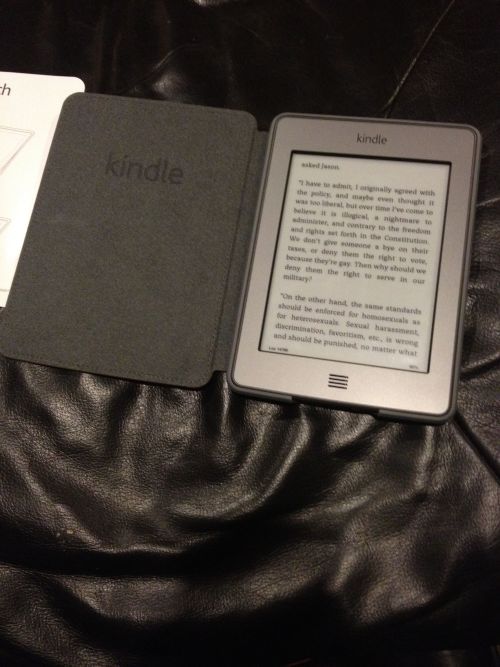
I've now had almost a week with the Kindle Touch, and I have to say, it is my favorite Kindle yet.  No more worrying about hitting the buttons and turning the page by accident.  No more arguments about which version of the Kindle had the best buttons.  A touch screen was needed for a long time, and now we finally have it.

When I review ebook readers (and I have posted reviews at various locations since the RCA REB1100), I like to get through a full book before I say anything about the device.  It takes time to get in the habit of something new, and snap decisions are not what someone who loves books is looking for in a review.

The Kindle Touch disappears in your hand while you read.  I'm not sure where in the process it happened, but touching the corner of the book like I would do with a normal book to start turning the page felt natural.  Page changes were quick and without as much 'flash' as previous generation eInk devices.  The contrast seems better as well, but I think I have said that about every generation of eInk displays, and I know that everyone looks at them differently.

What I have to say though, is for me, this is THE ebook reader.  For long-form reading, I won't use anything else....until the next new thing drags me away I guess.

Kindle Fire Review Part 3 - The Boy

The Kindle Fire seems to weigh... an average amount for it's size.  However, the sleekness of it is too smooth, thus making it too hard for me to use without a case...... the case is definitely recommended.  

The up side to it is that the arrangement of the device is making much easier to access the music, applications, and the other stuff.  It's basically a smaller version of the iPad... Kinda...

Kindle Fire Review Part 2 - Mom

During the week I commute by train between home and work. I also travel for work and spend a good amount of time in airports and airplanes. I like having the convenience of multiple apps in one device, which makes my iPad and iPhone very convenient.

I have not been a Kindle user as a stand alone device, but I like the size of the Kindle Fire and find it works much better for commuting than the iPad. The screen size on the Kindle Fire is great for reading, to play games and music. However, I prefer the screen size of the iPad for watching movies over the Kindle Fire.

If I want to go relax at a coffee shop to read and listen to music I would prefer working with the Kindle Fire. But, if I want to be productive and work at the same coffee shop I will take my iPad.


Kindle Fire Review Part 1 - Dad's Take

OK, the Kindle Fire arrived this morning.  

The first thing you notice when you turn it on is the small things.  As soon as it connected to Wi-Fi, it popped up with my name and a welcome.  No registration (Amazon took care of that before shipping), no login to my Amazon account.  It just knew and worked.

The Carousel already had all of the books I have ever bought from the Kindle store ready to download.  It knew I was a Prime member and video streaming was ready as soon as I tapped on the video link.  Selecting music brought up not only music bought from the Amazon Music Store, but also the music and audio books I have uploaded to my cloud drive.  Sometimes the small touches make all the difference, and just like with the original Kindle Amazon gets them right.

The weight is on par with other tablets of this size, which is to say it is heavier than expected but not uncomfortably so.  This is the part where most reviewers would recap the specs and compare them to the iPad, or the Nook Tablet that is being released today.  I don't think the target audience of this tablet really cares though, so I'll keep this easy.  The screen quality is great, whether reading a book or watching video or playing a game.  The sound from the speakers is good and can get loud enough to be heard.  Overall it is a serious device, and comes across solid and well executed compared to other tablets I have tried.

Looking deeper into how things work in normal use, there are a few choices that Amazon made that are interesting to me: 

First, reading (which the Kindle brand is known for) is easy.  However, one of the features I love from the iPad version of the Kindle Application is nowhere to be found.  There is no way to change the background or text color that I can find.  While black text on a paper white background is ok, I find a sepia type background easier on the eyes.  I can make the change with two taps on the iPad app, but it isn't anywhere that I can find on the Fire.  Adjust the brightness makes it easier on the eyes, but still a curious decision.  

Second, Applications, which I would have thought would be better refined (highlighting the applications made specifically for the Fire) were anything but.  Bestselling applications are front and center, rather than applications made for Fire.  Not good or bad, but an interesting choice.

Third, Newsstand needs work.  I downloaded Car & Driver magazine as a test, and was less than impressed.  Once the magazine loaded there were large blank grey spaces at the top and bottom of the page.  When zooming in to read, movement to the next column actually moved to the next page, which was again reduced to the point that it was unreadable.  They are going to have to get this better to compete with Zinio.

Overall, I think Amazon will do well with the Kindle Fire.  It's price point sets a new bar in the Android tablet game, and Amazon's reach and mind share will bring it to a far broader audience than the others in this space have been able to garner.  Add all of this to the fact that Amazon has an ecosystem in place to handle all of the consumption of media and applications the common user could ask for and you have a recipe for success.