Like any Fat Boy, I love biscuits and gravy. I sometimes get tired of the same old thing though, so I decided to try taking biscuits and gravy up a level. In place of biscuits I went with a savory scone filled with ham and cheddar cheese, and I smothered it in a classic bacon gravy.
Read moreReview: Typo Keyboard
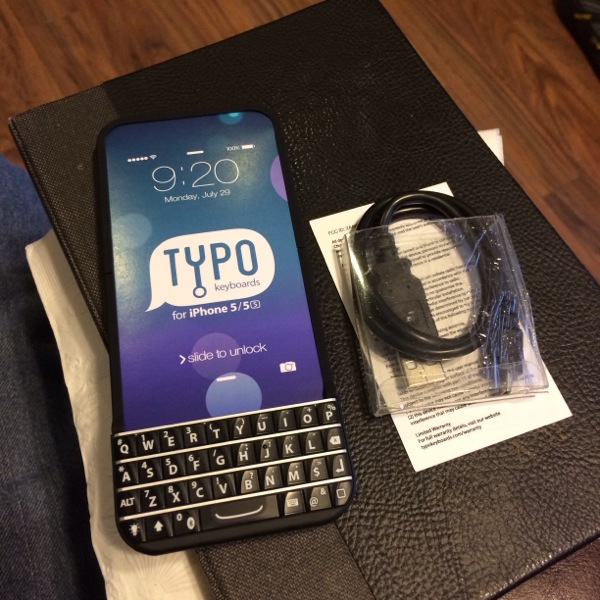
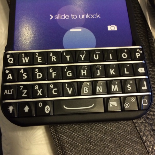
Today I received the Typo Keyboard, made famous by way of Ryan Seacrest's investment in the company and the lawsuit they face from Blackberry over the layout of their keyboard.
Right off the bat, the fact that the keyboard needs to be plugged in separately from the phone is a killer. The second thing you notice is that typing here isn't nearly as easy as it should be. At least for my thumbs, typing is cramped and difficult to get up to speed even after 20 minutes of practice.
The good news is it adds very little bulk or size to the unit. It feels good in the hand, and is responsive to touch.
If you really need a full time keyboard on your iphone it might be a good try, but for me the short comings make the $100 price tag far too high.
A Judge ruled late yesterday that there was sufficient cause to believe Typo would lose their lawsuit brought by Blackberry, and therefore ordered an injunction against marketing and sales of the product. More details can be found on Engadget here.
Review: Salted Chocolate Covered Caramels from The Candy Basket
In 1934 The Candy Basket Inc. opened its doors, hand making delicious chocolate confections to delight its local communities. Several generations and three factories later they have grown into a full line confectioner offering a wide variety of chocolates, toffees, brittles, fudges, corns, and jells. It is their goal to bring their customers memories of grandma’s “Heavenly Divinity”, mom’s amazing “Red Velvet Cake (truffle)”, and the summer time treat we all enjoyed as kids, dreamy “Creamsicle Fudge”, of course…It’s all just Pure & Simple.
Read moreDinner Tonight: Fat Boy's Chicken Cacciatore
I was trying to decide how to use some chicken that had been sitting in the fridge all weekend, and decided a nice rustic cacciatore would be perfect on this cold winter night.
Read morePhoto Review: Paper - FaceBook has never looked better
Today FaceBook released a new way for iPhone users to interact with their network, a stunning app simply called Paper. The design team, led by former Apple designer Mike Matas and the team he brought to FaceBook with him in 2011 when his digital publishing company Push Pop Press was aquired.
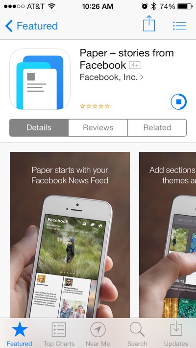 Paper is a free download from the App store, and signals a completely new way to interact with FaceBook, bridging the gap between news sources and your news feed.
 When you first launch the app you are greater by a short video into showing off the application with the simple title screen shown here.
 You are then guided through the process of adding additional news sections to your "Paper"
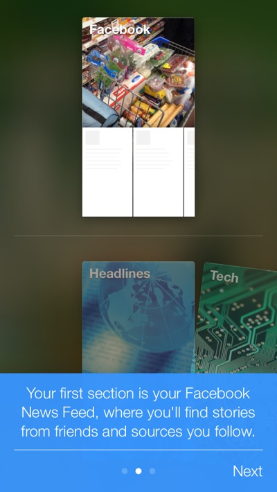 The tutorial guides you through the process explaining how the sections relate to each other.
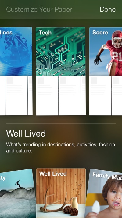 There are plenty of preconfigured sections available, and I would guess more will be coming as the application grows.
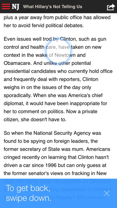
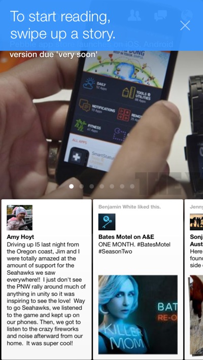 Once you finish adding sections, you are taken to your news feed. As you use the app, blue pop-over dialogs guide you through using the program.
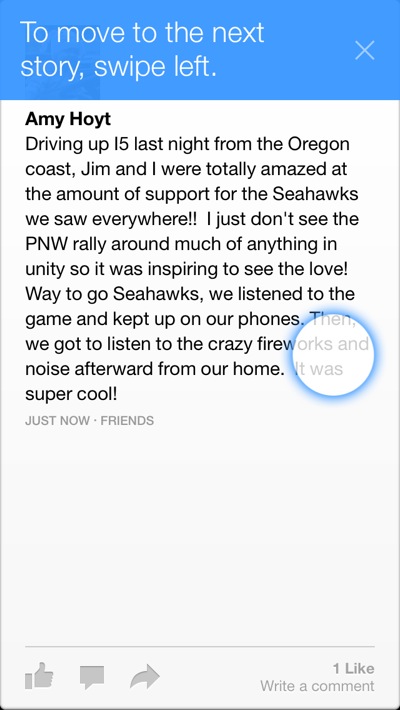
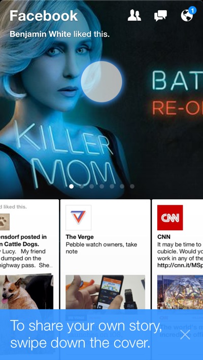

 Adding a post has the same elegance of the rest of the app. They did this thing right, and it shows they didn't miss a trick.
 News sections are just as clean and easy to navigate. Swiping up takes you deeper, swiping down takes you back out closer to your timeline.
 Once you've tapped on an article to bring it up, swiping up "unfolds it", taking you to the website that is the source of the original article.
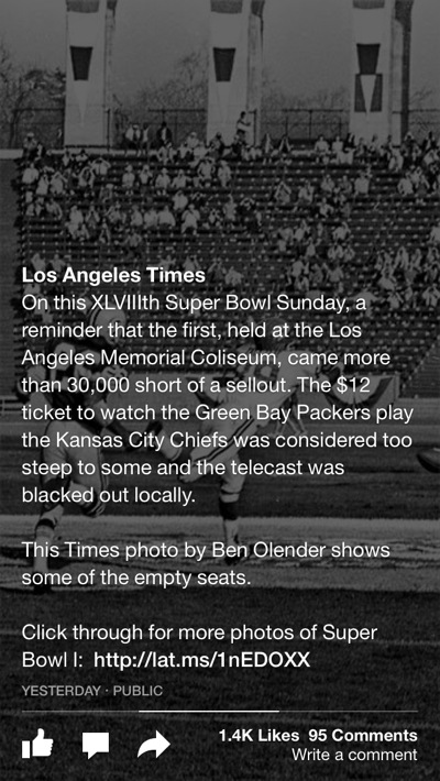 Photos on your timeline display full screen, and pan when you turn your phone if they are wider than the phone.
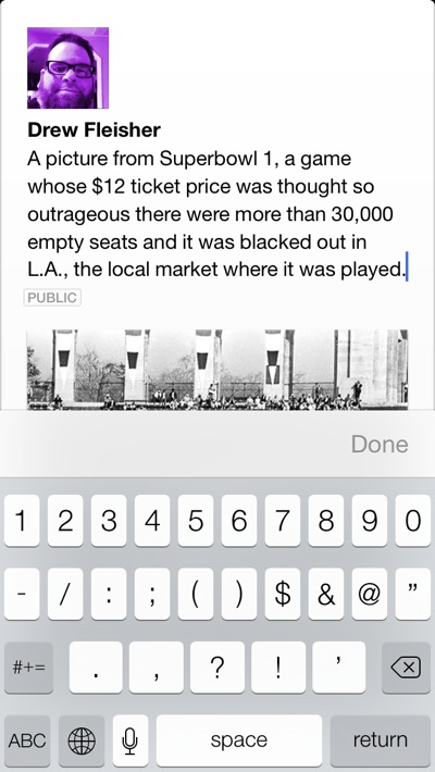 Re-posting a photo looks just as clean as anything else in the app. These guys really did a great job.
Conclusion
The folks on the Paper team have done what they were asked to do - try and disrupt FaceBook from the inside before someone outside had the chance to. Drawing on every design element Apple gave them to play with in iOS 7 this team has put together a smooth application that after just a few hours has replaced the regular FaceBook app on my iPhone, and I'm sure it will on yours as well. Trust me, once you spend a little time with it you will never go back.
Teknoholics Project: Mobile File sharing with PirateBox/LibraryBox


Last summer an interesting Kickstarter project launched, and was quickly funded at more than ten times it's requested ammount. The project was LibraryBox 2.0, a fork of the GNU GPLv3 licensed PirateBox art project by Dr. David Darts. The initial concept was to transform any space into a temporary communication and wireless file sharing network. When users join the PirateBox wireless network and open a web browser, they are automatically redirected to the PirateBox welcome page. Users can then immediately begin chatting and/or uploading or downloading files.
LibraryBox takes PirateBox to a little safer ground by sharing a library of files but no longer allowing people who connect to it the ability to upload potentially copywritten materials. The idea was the brain child of Jason Griffey an associate professor and head of Library Information Technology at the University of Tennessee at Chattanooga. His thought was that taking such a system into areas with limited or no internet access with a library of books, learning materials, disaster survival materials etc. could be of great assistance in disaster recovery areas, or foreign countries where access to the internet is severely regulated.
The project was featured in this months issue of MAKE: magazine, and since I already had the materials needed on hand I decided to play around with it to see how easy it was to get up and running.
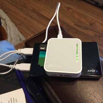
The foundation that the project is built on is a small wireless router from TP-Link, the MR3020. This small portable router is desgned to be used with 3G USB modems to share cellular data connections via wi-fi. The software of the router is overwritten with a program called OpenWRT, which for all intents and purposes turns the router into a web server.
The next thing that is needed is USB storage to house the files that are going to be shared. I used the Leef Fuse 2.0 32GB High-speed USB Flash Drive with Magnet Cap and PrimeGrade Memory (Charcoal/Black). I had other USB flash drives around, but this was the smallest with a decent capacity to be able to store data.
While that is all that is needed, to make my setup a little more portable and easier to deploy, I added a 12000mAh portable power bank that I had laying around.
So for you to build the exact setup I have put together would be less than $100. For that money you get a completely mobile filesharing device with 8-12 hours of uptime before it needs to be plugged in! Not a bad setup. You can use it to share files at a LAN Party, to share information at an outdoor event, or even as a kind of Digital GeoCache, where people can check-in on the wall to prove that they found it, and download a file or upload a file as well. The options are endless, and changes are relatively easy to make.
You can find the original project and instructions for the PirateBox here. Information on Jason Griffey's LibraryBox fork is available here, or in MAKE Volume 37, page 74.
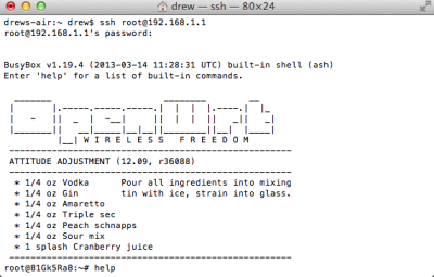 This is what you see in Terminal once you have connected to your MR3020 for the first time after it has been modified
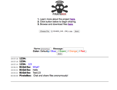 Uploading files and leaving notes on the chat board are easy tasks to accomplish
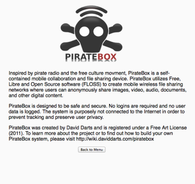 The main page information link takes you to this captive page with more details about the PirateBox concept
Dinner Tonight: Fat Boy Heaven's Gluten Free Mexican Mac and Cheese with Chorizo and Green Chiles
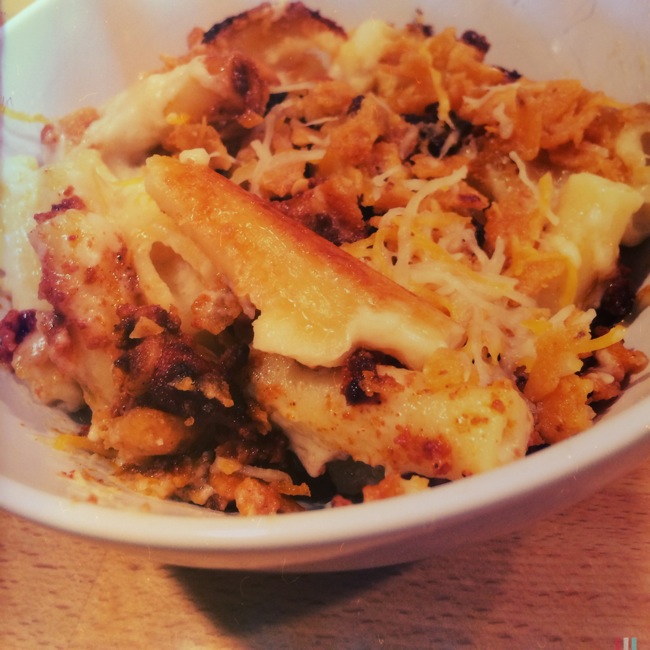
A Classic Mac and Cheese recipe updated to be Gluten Free and kicked up with Mexican Chorizo and New Mexico Green Chiles.
I had some chorizo in the fridge and was trying to come up with a way to use it when I started thinking that it has been a long time since I had made Mac and Cheese. I picked up some gluten-free pasta made from quinoa flour and threw this together. It got rave reviews from the family, and I loved it as well.
Read moreDinner Tonight: BBQ Pork Sandwiches on pretzel buns
Last nights leftover Kahlua Pork becomes BBQ Pork very easily with just a little BBQ sauce
One of the great things about doing the Kahlua Pork last night is that there is always plenty left, especially when it is just the kids and I eating. Since it is just slow roasted pork butt, adding some BBQ sauce made it a simple transition to sandwiches on night two. I love that our local grocer has started selling my favorite kind of sandwich buns - pretzel buns.
Cooking more than you need for a meal means dinner prep the following night can be a lot easier if you are careful not to over season your meat for the first meal in the chain. In this case the pork was seasoned just with salt and liquid smoke, so adding BBQ sauce didn't conflict with any flavors.
Dinner Tonight: Crock Pot Kahlua Pork
Kahlua Pork with Steamed Rice....so basic yet SOOOOOO amazingly full of flavor and goodness
When I was working full time at my last job, I had a few co-workers who were Hawaiian, and one of them shortly after I started introduced me to what he called "Kahlua Pig". When we found a Hawaiian restaurant down the street from work that several of us began to frequent, this was the dish I ordered most often from the menu. There is something just so basic about pork that is slow roasted without really any additions for more than 16 hours that is an amazing delight to any pallet.
Read moreReview/Preview: Beats Music
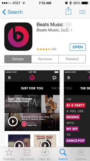
Beats Music, LLC. - the company that has built a huge name for itself with it's Beats by Dre line of headphones today launched it's own online streaming music service. While similar to those already offered by Apple, RDIO, and Spotify, Beats has a few unique features that may help launch it to the front of the pack.
The biggest asset is the group of music industry insiders that run Beats. Jimmy Iovine is not only chairman of the board of Beats, LLC he is also Chairman of Universal Music Groups Interscope/Geffen/A&M record company. This gives him access to new artists, industry trend data, and perhaps a huge advantage in negotiating deals for licensing of music for the service. Add to that the fact that Trent Reznor of Nine Inch Nails and Dr. Dre are also on the board of directors and you have some huge name recognition backing this service that none besides Apple's iTunes Radio can come close to.
Beats also has already worked deals with AT&T to provide family plan subscribers with direct billing for up to five members of the family to sign up for the service with a 90 day free trial and family membership price of $14.99/mo versus the normal individual rate of $9.99/mo. This is a huge advantage out of the starting gate for a new service, as it looks like this service will be sold as an add-on in AT&T's retail locations as well as online.
One of the unique features Beats brings to the table is a playlist generator it calls "the Sentence".
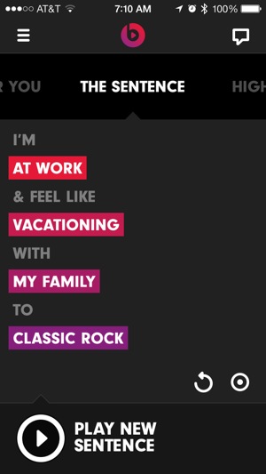
You set variables including music genre, where you are, what you are doing, and who you are with; Beats generates a playlist from those variables to match the occasion.
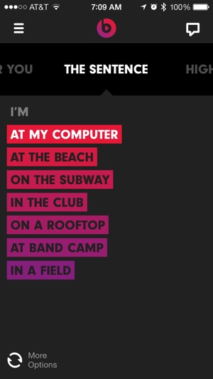

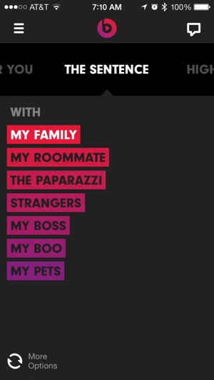
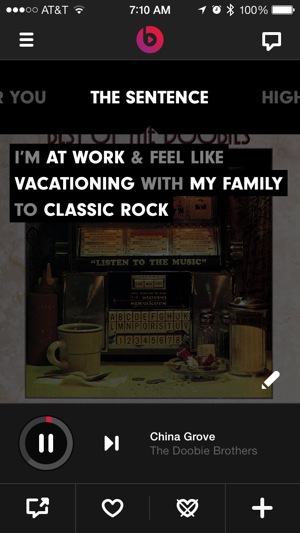 After setting the sentence that applies, Beats Music starts playing a new playlist it thinks fits your criteria.
Add to all this curated playlists ranging from The Academy of Country Music and Grand Ole Opry to Ellen DeGeneres and Rolling Stone Magazine, and you have the makings of a pretty great launch of a new service. Only time will tell if all of this will be enough, but so far I'm impressed with what they have brought to the table.
Kickstarted Review: Foodie Dice
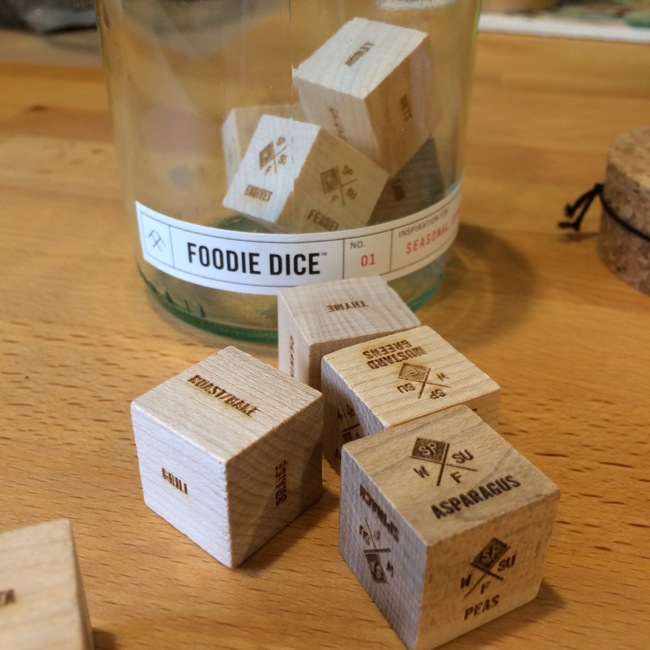
In September of 2013 an idea popped up on Kickstarter that got my attention: Foodie Dice. The concept was to turn meal preparation into a game. You have nine dice which indicate protein, cooking method, grain/carb, herb, bonus ingredient + spring, summer, fall, or winter veggies. This gives you over 186,000 combinations to jog your creativity in the kitchen.
Read moreReview: The Brick from Binatone
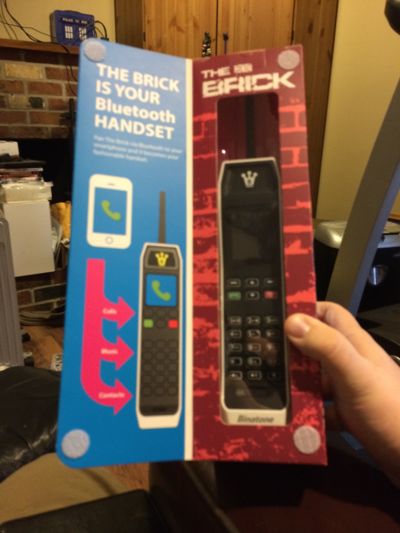
When one of the first press releases I saw from CES this year was the announcement from Binatone that they were bringing back the old Brick cell phone form factor from the late '80s/ early '90s I was sceptical. When I read further and saw that it could not only work as a 2G cell phone but could also function as a bluetooth handset for my iPhone, I get a little more intrgued.
While the exterior dimensions are familiar to anyone who grew up with these phones, the first thing you will notice is the weight being greatly reduced. Modern electronics are a lot smaller and lighter, and it is noticeable. The Brick will support an optional XXL battery that will provide up to 6 months of standy time(!), but ships with a battery that provided me with about 3 days during normal use connected via bluetooth to my iPhone.
In addition to it's bluetooth functionality it also has a built-in FM radio, calendar, everyones favorite cell phone game snake, an alarm clock, and will access your address book via bluetooth from your smartphone so that you don't need to program numbers into it to dial.
In all, it works as designed, and has that old school charm that will bring back those early days of technology for a lot of us. Sound quality is very good, and volume is surprisingly loud from the speaker.
I must not be the only one intrigued, as their inventory is completely sold out and backordered for several weeks. I'd pre-order now, as they are likely to stay sold out for a while. The device can be ordered for $69.99 from their website.
Dinner Tonight: Gluten Free Burrito Bowls with Beer Braised Carnitas and Cilantro Lime Quinoa
A Gluten-Free take on the Burrito Bowl that I like better than those served at the popular chains
I was trying to decide what to do for dinner tonight, and Wednesday are always hard with church, school activities and work schedules for everyone to eat together. I decided I needed to find something that would be easy for everyone to eat or re-heat as they got home this evening, and started thinking about the burrito bowls at one of my favorite Mexican restaurants. One of the things I decided right away was that I would do carnitas in the crock-pot so I wouldn't need to keep an eye on it all afternoon, and the next thought was "maybe quinoa would work instead of rice to make this more nutritious and gluten free".
Read moreReview: Jerseys from Geeky Jerseys.com

A few months ago I came across a hockey jersey design by an artist named Dave Deslisle, and in looking at his website found that he had worked with the folks at Geeky Jerseys to bring some of his designs for hockey jerseys to market. That led me to contact them about some of the other great designs they had currently and previously.
They will typically offer a design for 2-4 weeks (until they reach a minimum number for production) and then it takes 4-6 weeks for production before they ship to buyers. It seems like a long time in the internet age, but once you get your hands on one of these jerseys and see the quality that goes into custom making every patch and then sewing the entire jersey together you will understand the time it takes to make these jerseys appear on your doorstep.
I can tell you that this jersey is of a higher quality material and better stitching than the official NFL jerseys I have from Nike and Reebok. Sizing is accurate and a little roomy, running about a half-size big. While these jerseys are not cheap, you will not be sorry that you spent the $99 for this purchase.
I have a couple more on their way over the next week or so, so we'll see if all of their product has this same level of quality, but unless proven otherwise I strongly recommend the quality and workmanship of their product.
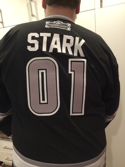
Tonight I recieved my second jersey from the folks at Geeky Jerseys, and am once again impressed with the quality of the construction this company puts into their product.

One of things I love is that when they do a new design, they not only are changing the designs colors and making new patches, but everything changes, from the piece work of the sleeves to the collar. Everything works together to make the design an extension of the franchise they are trying to emulate.
Kickstarter Project: Dustcloud

Dustcloud is an interesting new Kickstarter project that has me intrigued. The idea and proof of concept evolved in Prague during 2012, while the people involved worked together in a bar in the old city. They came up with a spy game, and started brainstorming how they could make it work online. The result took them to China to design hardware, and resulted in an ambitious project. Their goal is to build a combination social network and online role playing game based on cold-war era espionage and assassination.
The only issue is that it's ultimate success will depend greatly on rapid adoption. In Europe it would be easier, as travel between countries is much more common, but in the USA unless a large number of players in major cities are involved it would become boring pretty quickly. It is definitely an interesting idea, and one that I plan to keep an eye on though.
Fat Boy Review: BottleKeeper Brewtis
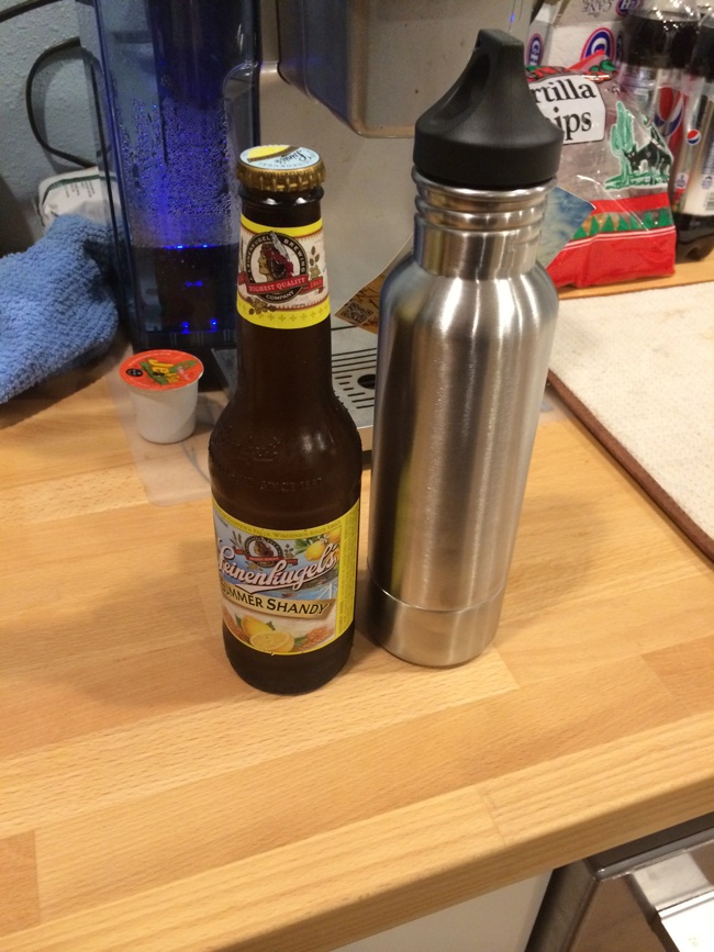
In September a couple of cousins went to Fundable with the idea for a new way to protect their beer from the heat and elements. They called it BottleCamo, but after realizing that this might be seen as trying to encourage hiding beer from the authorities rebranded as BottleKeeper, and after months of production and customs delays finally have their pre-orders hitting the doors of folks who backed their project. Follow the link for pictures and details on why this is how all of my bottles will be carried from now on.
Read moreDinner Tonight: Italian Quinoa
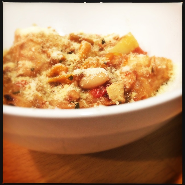
We love Italian food in our home, and a frequent quick meal our kids yell for is a quick dinner of pasta with a sausage sauce. I decided to try and take it to another place tonight by using quinoa to make it gluten-free and Paleo friendly. Roasting the tomatoes take a lot of extra time, but cooking the quinoa will take most of the 50 minutes or so you will need to roast off the tomatoes, and trust me, there is no way to substitute the depth of flavors you will get unless it is summer time and you can throw whole tomatoes on the grill to slow roast them there. The spinach will add some great contrasting flavor in addition to the contrasting color it brings, and you can add more than I did if you want more greens, but my kids were rebelling even with this.
Read moreBreaking News: Japanese Suntory buys Beam Global
Just two weeks before the Bourbon Classic, the whisky world caught fire this morning when Beam Global announced that they were being acquired by Suntory Group of Japan, creating the third largest spirits company in the world. While many in the American whisky market are shocked by the news, it really is just the continuation of a globalization that has been ongoing in the spirits market for quite a while.
Beam Global had already branched out, and as of the time of this announcement included Jim Beam Bourbon, Maker's Mark Bourbon, Sauza Tequila, Pinnacle Vodka, Canadian Club Whisky, Courvoisier Cognac, Teacher's Scotch Whisky, Skinnygirl Cocktails, Cruzan Rum, Hornitos Tequila, Knob Creek Bourbon, Laphroaig Scotch Whisky, Kilbeggan Irish Whiskey, Larios Gin, Whisky DYC and DeKuyper Cordials. In recent years we have seen other high-end spirits mergers with acquisitions of Pernod and Diageo bringing other American whiskey brands into their portfolios that had already included premium scotch and blended Canadian whiskey products.
he deal agreed to by both boards in this case gives Beam Global stock holders a 25% premium over last Friday's closing stock price, and comes in at around $16 Billion, making it the second largest single spirits acquisition to the Pernod deal in 2005 that came in at around $17.8 Billion.
While only time will tell what this merger will do to the brands included, the fact that there is almost no overlap between market footprints of the two companies means we should see little change according to market insiders. Just as Beam's acquisition in 2011 of Maker's Mark did not change the way that great bourbon was produced, the overall impact should simply be one of increasing distribution and marketing reach of great traditional brands. The greatest fear of most American whisky insiders is that this increased marketing will make already scarce premium Bourbons in even shorter supply domestically, which in the short term is a definite reality.
Kickstarter Project: Geek A Week Year Five Two
For several years artist Len Peralta has been drawing Geek trading cards in his "Geek-A-Week" series. It started as paintings which were published on his website, and then ThinkGeek actually printed up and sold the first series. Since then he has relied on KickStarter to fund additional expansion, and he is getting ready to start on his 4th set, titled Year Five Two. I've long been a fan of Peralta's work, and have all of the cards printed so far, so when I got an email from him today announcing this project's release I had to get it out to all of you. Follow the link below and take a look at his work, the new designs, and the rewards available. Len is a very talented artist who has done a lot to help further the advancement of Geek culture with the campy style of this painting series.
Geek A Week: Year Five Two by Len Peralta — Kickstarter:
Help artist Len Peralta create 52 brand new Geek A Week cards! Another full year! New design, new geeks!
Dinner Tonight: Saucy Hungarian Red Potato Goulash with Smoked Sausage and Savory Caramelized Onions
Few things warm you up on a cold winters night like a nice spicy ghoulash
I was looking for something different tonight for dinner and ran across this great recipe for a spicy potato ghoulash. The smoky spice of paprika dominates, but also works well with the kielbasa sausage and the wonderful sauce created by the combination of broth and the starch from potatoes cooking down. A wonderful meal when served with a nice crusty bread.
Read more


